Today at Ignite 2017, we announced SharePoint hub sites, a new building block of the intranet, to bring together related sites to roll up news and activity, to simplify search, and to create cohesion with shared navigation and look-and-feel.

You can use SharePoint hub sites to organize concepts, teams, divisions, or resources throughout your businesses. Let’s dive into the details.
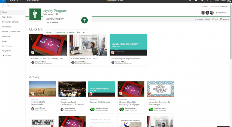
Create a cohesive set of related sites with shared navigation, look and feel
A hub site brings consistency across sites from the top down. When a team site or communication site is associated to a hub site, it inherits common characteristics, including:
- Navigation – Define top navigation in the hub site that is inherited by associated sites.
- Theme – Define the look and feel of the hub site, and that theme remains consistent across associated sites.
- Logo – A logo on a site is like the green sticker on a map that says, “You are here.” It’s an important identifier of the site you are visiting, and the information and people the site represents. A consistent logo defined by the hub site and used by associated sites says, “You are here, and you have not left.”

Roll up and present a consolidated view of news and activities
Throughout the lifecycle of your projects, your launches, your internal campaigns, it is important to increase visibility, awareness and discoverability beyond the core day-to-day people, and not expect everyone to have to drill into the various related sites, but more represent a clear, broad picture of what’s happening across sites, aka, what’s happening across projects and initiatives. Team sites and communication sites push content and information up to the hub site level with:
- News aggregation –After you create and publish a news article on an associated site, the news article surfaces on SharePoint home, in the SharePoint mobile apps, and now on the hub site’s home page.
- Combined site activities – It’s important to know what is happening within sites, so you can prioritize your focus and your time. Site activities are visible on a team site’s home page, and on the site’s card on SharePoint home. Now, site activities will roll up from each associated sites so that they are visible on the hub site’s home page, so you can see what happening across related sites, instead of having to view activity site by site.
- Scoped search – When you search for content from a hub site, results include content from all associated sites. Because associated sites are related, search from the hub site home page increases relevance, and enhances content discovery.
Create hub sites and associate team and communication sites
It is easy for admins to create one or more hub sites. After a hub site is created, site owners can associate existing team sites and communication sites with the hub site, or to associate a new site while creating a site from SharePoint home in Office 365Soon you will be able to create an associated site directly from within the hub site itself.

Site owners can associate an existing team site or communication site with a hub site.
- Click the gear icon in the upper right of the site.
- Click Site information.
- In the Edit site information pane that appears, click the Hub site drop-down menu and choose the right hub site to join.
Note that team sites and communication sites can only be associated to one hub site. And as easy as it is to join a site to a hub site, you, too, can un-join from one. This is the power of a dynamic intranet, one that can change and adapt with the ebb and flow of your ever-changing business landscape.
Access hub sites and associated sites with the SharePoint mobile app
The SharePoint mobile app helps keep your work moving forward by providing quick access to all your sites, news and the team members you work with, and search to find content and people across your organization.
With the addition of SharePoint hub sites, the SharePoint mobile app will be updated to natively render hub sites, and their pages, news, and content, with smooth navigation between associated sites and the scoped search experience. Find what you need on the go, and get going!

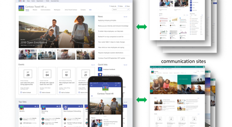
Moving forward and growing together
Team sites, communication sites and now hub sites – as well as classic publishing sites and sites for applications – are building blocks of your intranet. SharePoint connects the workplace so that you can share, manage, and find the content, knowledge, and apps you need, on any device.
As you modernize and extend your intranet to support collaboration and communication, SharePoint will support you and your teams now and into the future.
Let us know what you need next. We are always open to feedback via UserVoice and continued dialog in the SharePoint community in the Microsoft Tech Community —and we always have an eye on tweets to @SharePoint. Let us know.
—Mark Kashman, senior product manager for the SharePoint team
FAQs
Q: When can I expect to see SharePoint hub sites appear in my Office 365 tenant?
A: SharePoint hub sites with begin rolling out to Office 365 First Release customers in the first half of calendar year 2018.
Q: Can a hub site replace my current organizational portal?
A: Hub sites are designed to let you dynamically organize closely related sites, bringing together similar projects, and binding related assets, and presenting common activity. Customers with portals that include customization beyond the web parts and extensions that SharePoint Framework currently supports are likely to continue using the SharePoint publishing infrastructure, which continues to be fully supported both in SharePoint Server on-premises and SharePoint Online.
Q: When should I use a team site, and when should I use a communication site?
A: Your SharePoint team site lets you share content, knowledge, news and apps with your group as collaborate on a project. A communication site lets you tell your story, share your work, and showcase your product across the organization.
- Tags:
- hub site
- intranet
- SharePoint
- sites

 .
.